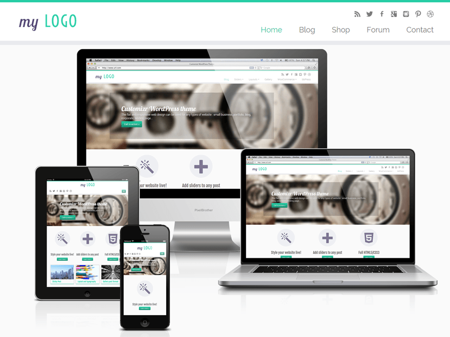
Good layout and flexibility with overly-challenging setup
By David Burkhart, 2013-11-25
via wordpress.org
The theme’s screen shot and description plays up the good parts enough. So, let me just skip to the problem areas you’ll have to deal with.
- If your logo is outside of a 5:2 aspect ratio, it will be stretched to become so in the latest Chrome (31) and Internet Explorer (11). This is caused by a legacy hack in the theme’s “skin” style sheets that was meant to overcome a layout problem in IE 8. This hack attempts to default all image widths to “auto\9”, apparently no longer working in any browser. My work-around for this is to add the following rule to the “Custom CSS” section of the theme’s custom settings (Appearance / Customize):
img { width: auto; } - The nice, circular, featured-page portals on the front are not compatible with IE 9 or earlier. So, all Windows XP users still using Internet Explorer will see static rectangular portals instead. This is still a significant crowd to just ignore.
- New users of this theme will likely be searching around for quite a while, looking for how to create a slider. The controls for managing sliders are intended to be (at best) at the bottom of the Media Editor in a section titled “Slider Options”. However, a problem with the theme causes this functionality to not be initialized. My work-around for this, thanks to a theme user named Joe, is to go to the theme’s custom settings (Appearance / Customize) and change the “Front page displays” setting to “Don’t show any posts or page”. Save this change and then edit one of the library images to ensure the slider controls now appear at the bottom. If the controls are there, you can now change the “Front page displays” settings back or to whatever else you prefer. Don’t forget to select the slider in the custom settings!
- The next issue is with the navigation menu. Menu choices which have submenus (dropdown menus) leave no way for visitors to access the top-level link. My work-around for this is simple enough, add a new choice to the top of the submenu labeled “Overview” or “General” which links the same as the top-level link.
- The next issue is a misleading credit in the footer. The credit for the theme producer appears as “Designed by Themes and Co” and at the bottom of every website page. This obviously leads any visitor to think that Themes and Co designed the website, not the theme you used to create the site. I have no work-around for this. The theme’s code seems to strip out any changes I attempt to make to the footer through the Custom CSS settings or the main style sheet. So, this may be a show-stopper for web designers and developers.
In conclusion, with all of those problems aside, this is still a nicely laid out theme and seems easy to maintain once you get beyond the challenging initial setup. Though I have reservations about the last issue with no work-around, I have decided to give this theme a chance and start using it for my main business website.
Additional Thoughts
Setting up the front page slider is much more confusing and cumbersome than it should be. Primarily, having to manage sliders by using the Media Editor to edit image files doesn’t make sense. Users do not need to edit the images. Instead, they must painstakingly, for each image, flip a switch for it to be used in a slider, then select the slider and change any other slider settings. I’m sure this was a convenient way to pass-off management of the library files. But, integrating a more thought-out slider plugin, like Meta Slider, into this theme would have been a better choice.
The issue with the navigation menu may have been an intended limitation at one point since touch-screen-only devices have no way to hover in order to access the submenu. But, only the most thorough website developers are going to catch this. When the others miss it, it will raise the tension level between them and frustrated site owners who realize most of their visitors have been missing critical overview information.
Regarding the misleading credit in the footer, I know what many of you are probably thinking: “This is a free template. The theme producer needs and deserves the exposure.” And, I totally get that. In fact, if I can get a working fix for this last nagging issue, I plan to contribute monetarily once I have determined an appropriate amount (as should you all if you plan to continue using this theme). But, as a website designer, I cannot accept someone taking credit for my designs. It’s counter-productive and would damage my relationship with my website clients. So, I can’t use it for my websites advertising my creative services nor for the websites I create for clients.
Notes for Nikeo, Theme Author
Regarding the issue with the navigation menu, the triangle which appears beside menu choices with a submenu made me think it was the way to access the submenu. Though this would have been a difficult target for any smart phone visitor, it seems like a better alternative than having no access at all to the top-level menu link. A more intuitive alternative would be a dropdown slider control which appears underneath any menu choice with a submenu. This would be complimented with a downward-flick control to both the top-level link and the slider control for accessing the submenu. This combination should take care of this issue for both mouse-using visitors and touch-screen visitors.
Lastly, while I’m on the subject of the navigation submenu, it could use a tweak or two regarding the styling. As it is, the whole submenu seems to read like an article. Custom theme controls for navigation menu style would be ideal – or, at least a choice between 3 or 4 predetermined looks.


