Themes Hunter
Categories
Login
About Themes Stats Blog Video Contact
Register Log in

MyMagazine

Home Blog / Magazine
Live Preview Download Add to compare
Information Features Screenshots Reviews (2) Customisation

Latest Customer Reviews

Promises… By happywinke, 2016-09-04 via wordpress.org

Finding a theme for your blog is like going on a date where marriage is a possibility. If your date begins to show signs of high maintenance, it might be time to run.

There are a lot of reason why I like this theme! The layout is nice and simple. The colors really speak to me. The pro version promises that you can customize it using tags and categories. But to be honest that’s like my husband promising me to make the most amazing lasagna when we went on a date. (It sounds like such an easy thing and yet 7 years later, no lasagna!)

The reason I bring that up is because it’s easy to overlook some promises but if certain flaws annoy you early on, you should consider not investing at all.

The theme promises to be light and responsive… I am using the free version right now and someone with the pro version might have a different experience, but it’s not very promising when plugins not created for this theme are masked.

They work, they simply don’t show up. When loading the page I can see the widgets attempting to show. When the dust settles it’s not there and the time that it takes slows down the page.

Plus the slideshow galleries in the post stop working. Something that promises to be light and responsive because it doesn’t have bloated plugins attached, sure goes out of it’s way to block plugins it says it plays nice with. (for example Jetpack)

There might be an easy solution. It might be to buy the pro version. Which because of it’s seductive look it might be my match made in heaven, but for me the things that make me want to run away as fast as I can are the moments where the text is unreadable;
(1) For clarity sake I cut a length of a post and pasted it into a new post. The new posts has a highlighted blue box surrounding the orange text with hyperlinks.
(2) The recent posts at the bottom of the page has a green border with the title/ excerpt in orange.

I find the theme promising but it gives me cold feet…

See all customer reviews (more based on 2 ratings reviews)

Description by Author

Mymagazine is a creative and responsive WordPress theme. It has a clean and colorful magazine style, perfect for news websites dedicated to sports or travels.
  • All
  • Home V1
Theme cover
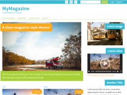
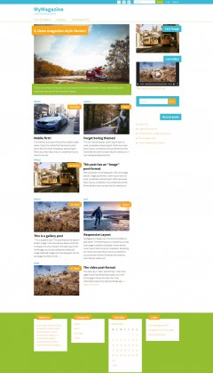
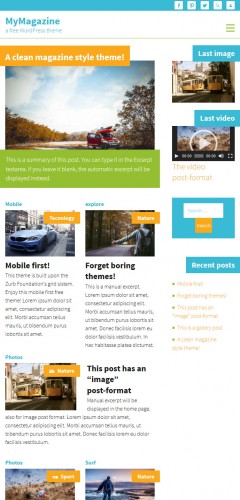
Home V1 (desktop)
Home V1 (tablet)
Home V1 (mobile)

Average customer rating

3.5

based on 2 ratings

Rating snapshot

1
0
0
1
0
  • Promises… By happywinke, 2016-09-04 via wordpress.org

    Finding a theme for your blog is like going on a date where marriage is a possibility. If your date begins to show signs of high maintenance, it might be time to run.

    There are a lot of reason why I like this theme! The layout is nice and simple. The colors really speak to me. The pro version promises that you can customize it using tags and categories. But to be honest that’s like my husband promising me to make the most amazing lasagna when we went on a date. (It sounds like such an easy thing and yet 7 years later, no lasagna!)

    The reason I bring that up is because it’s easy to overlook some promises but if certain flaws annoy you early on, you should consider not investing at all.

    The theme promises to be light and responsive… I am using the free version right now and someone with the pro version might have a different experience, but it’s not very promising when plugins not created for this theme are masked.

    They work, they simply don’t show up. When loading the page I can see the widgets attempting to show. When the dust settles it’s not there and the time that it takes slows down the page.

    Plus the slideshow galleries in the post stop working. Something that promises to be light and responsive because it doesn’t have bloated plugins attached, sure goes out of it’s way to block plugins it says it plays nice with. (for example Jetpack)

    There might be an easy solution. It might be to buy the pro version. Which because of it’s seductive look it might be my match made in heaven, but for me the things that make me want to run away as fast as I can are the moments where the text is unreadable;
    (1) For clarity sake I cut a length of a post and pasted it into a new post. The new posts has a highlighted blue box surrounding the orange text with hyperlinks.
    (2) The recent posts at the bottom of the page has a green border with the title/ excerpt in orange.

    I find the theme promising but it gives me cold feet…

  • fast and clean By masilaba, 2016-01-25 via wordpress.org

    Easy to use and clean. Good work!

Leave a review

Leave Review

WordPress Theme Installation / Wordpress Migration / Transfer / Cloning / Change Domain

Our Services as follows:

  • WordPress Installation. Free
  • Installation of Themeforest theme $49
  • Installation of Templatemonster theme $39
  • Adding plugins to WordPress $29
  • Renaming menu $45

Ways of communication:

  • Phone support
  • Chat 24/7 support
  • Email support
More info
Coming soon...
Coming soon...