-
great theme
By Justina, 2016-06-11
via wordpress.org
Simple, but has everything you need and works great.
-
Pure Elegance!
By infinitepoet, 2016-06-04
via wordpress.org
After experimenting a number of free themes for 5 days, I realized what an elegant theme ‘Nisarg’ is! Hardly needed any customization and the theme is soo good to start right off for a first timer like me !! Way to go Falguni!
-
Pretty and intuitive
By nmargono, 2016-05-25
via wordpress.org
Only released recently, it caught my eye immediately for its aesthetics. The theme is nicely customizable, and the developer is also very responsive with questions.
I agree that the theme should be more customizable, and I would pay a fee to get a premium version for that luxury. But, I understand software enhancements can’t come in an instant, and I’m just starting out with WP, let alone Web Design (rusty now).
-
Absolutely gorgeous!
By AlanT, 2016-05-25
via wordpress.org
Nisarg theme is simple, gorgeous, highly responsive and super-easy to set up. This is the first theme I actually didn’t want to change anything, except the few colors and to personalize it with my header image.
I was always almost completely redesigning every other theme I worked with. I would choose the simplest, whitest, most minimalist themes and add to them, rather than having to change everything to get the look I’d love.
This one – my header & few colors, and it’s perfect. Love it!
-
Clean and interesting
By Livsy, 2016-05-18
via wordpress.org
I wanted to find clean and well coded theme. This theme is defently one of the best themes in WP repository.
-
Fantastic theme
By malcolm302, 2016-05-11
via wordpress.org
Does 90% of what I want it to, most other themes I find hard to work with. I love the big image at the top of the page and the menu is really neat.
If I could have one improvement – it would be to have a second page template for a full width page without side bar.
-
Pretty and soothing
By cjwijtmans, 2016-04-25
via wordpress.org
It looks really soothing to the eye. There are a few major gripes though until i will switch from another theme.
The wordpress site is used for functionality, not really for blogging.
The sidebars are really in the way here, they take up screen space which is needed for other things, it would be nice to have an option for it. Also the main body of the theme is too small, which could be edited in CSS, however it would be nice to have an option for it. Currently i am using generatepress which allows me to do these things however it doesnt look so nice. This theme has a really nice header design going on and want to make use of.
-
Elegant theme that is easy on the eyes
By Michael Cruse, 2016-04-18
via wordpress.org
I love this theme because how it displays the content. It allows readers to focus on the content and not on general site busyness. The theme works great, and there are comments within the code if you want to tweak at that level. It looks great on mobile devices as well.
-
Nisarg is an Excellent Theme from Falguni Desai
By Howtobefit, 2016-04-18
via wordpress.org
I was searching for a look that I wanted that would work on all devices. I found Nisarg by Falguni Desai and it is exactly what I wanted. In every way it has excelled and I am thrilled to be using it.
-
simple and elegant
By mwlx, 2016-04-18
via wordpress.org
I have been searching for days for a simple and neat theme that shows the content in a way that would attract the viewers and works amazing on all devices Nisrag theme is the best one regarding all these aspects and above all you can tweak it to your liking! and as one of the reviews said maybe add a premium version with more control over the theme!
-
Very elegant and easy to use
By chrlm, 2016-04-11
via wordpress.org
I set it up in minutes and managed to adapt the menu bar to my website so that the navigation between the blog and the site are smooth.
I could also discuss with the author to do some adjustments. Perfect !
-
It takes a special image …
By rhadow, 2016-04-11
via wordpress.org
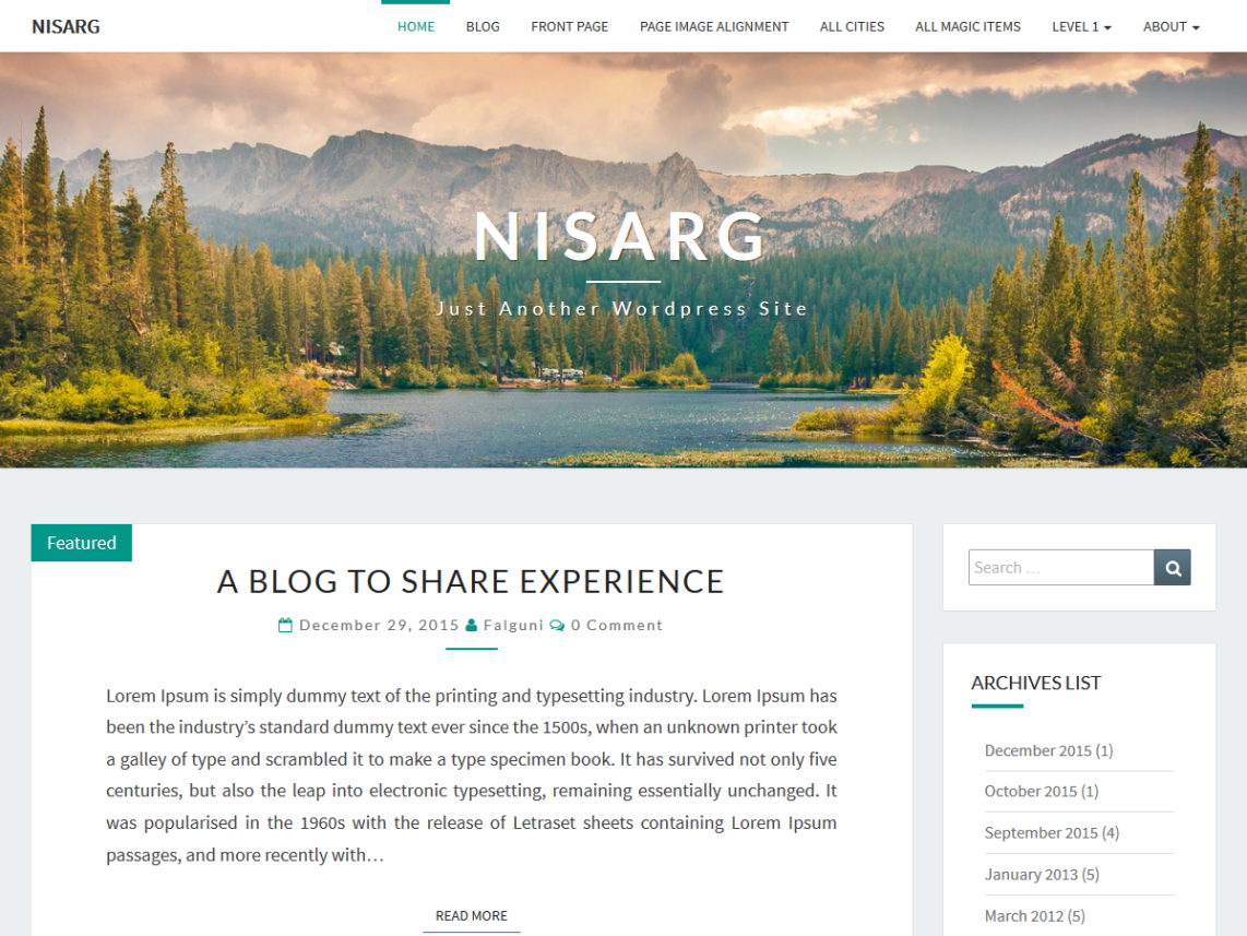
Nisarg is a beautiful means to highlight your latest written work and generate discussion. To do that requires a very special image 1400 x 400. Don’t expect to take a favorite image and crop it. You’ll need to shoot it specially to get a compelling image with a 3.5 aspect ratio.
I tried to slice a single image into header and background images, hoping they would stitch. It **almost** worked, and would have been great for me. The problem is that header and background are different widths. I’m not sure I want to spend the time to alter the code to make it work.
To the author — keep up the excellent work!


