-
amazing and ready to build a multilingual magazine
By Michel – xiligroup dev, 2014-01-25
via wordpress.org
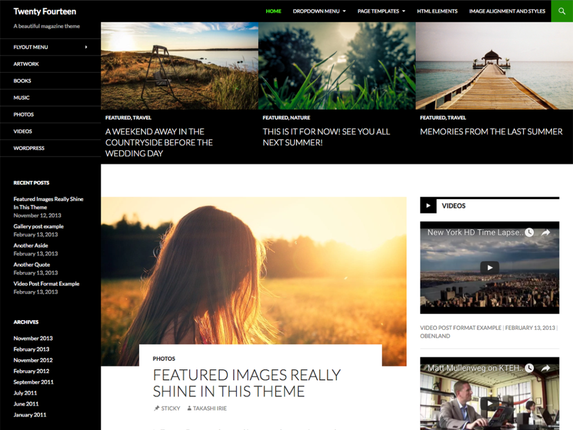
As author since 5 years of a multilingual plugin, Twenty Fourteen is the best default theme. Since beta, I was very happy to explore his architecture and to do some (few) adaptations to transform Twenty Fourteen (2014) through a child theme – [ link redacted, please do not post links in reviews ] – to become a full multilingual theme with xili-language trilogy. Lot of features are “changeable” according language (header, ephemera, featured,… ). This child (as previous for twentyten, twenty eleven, twenty twelve, twenty thirteen,…) is a good example for webmaster and theme developers to discover components of a well designed theme.
Enjoy,
M.
-
I like it very well
By Hinti, 2014-01-25
via wordpress.org
Mir gefällt es super
-
Not so good in IE.
By Eunice, 2014-01-25
via wordpress.org
It’s nice, but doesn’t display well in IE. In chrome there is a left side bar, but all the links etc. are squashed to the bottom of the screen in IE. Also, in IE there is a link, “primary menu” to get to the pages menu. Looks best in Chrome.
-
Simple, effective but missing a minor feature
By inlina, 2014-01-25
via wordpress.org
I like this theme. It is simple and you can tweak the appearance things easily. Only two things bug me; 1) I cannot increase the size of the max content width (I have tried a plug-in but that screws things up and I am not great with CSS.HTML); and 2) It keeps splitting words over 2 lines with a hyphen.
-
Nice, but too narrow
By intoxic, 2014-01-25
via wordpress.org
A very nice-looking, neutral blog theme with a lot of great features. Unfortunately, even though it has the tag full-width-layout, it is anything but. It is a left-aligned layout with a maximum width of 1260px, which will leave a blank space to the right on any larger screen. Even worse though is the fact that even if you disable the content-area sidebar and set posts or pages to the “full-width” template, they are only centered in the container, not made wider. The content width is always restricted to 480px which is extremely narrow for all but the most light-on-content sites. This borders on buggy behaviour.
As the articles in my blog can end up being quite long, this unfortunately makes the theme unusable for me in its current form. My readers would have to scroll down endlessly.
-
No me gusta/ Dislike
By Alessandro Degiusti, 2014-01-25
via wordpress.org
El tamaño de letra no me guste, es muy pequeño. Además, queda feo que el theme esté alineado hacia la izquierda, quedando un espacio en blanco a la derecha.
Esta vez, WordPress me decepcionó…
******English****
The font size I do not like, it is very small. In addition, the theme is ugly is aligned to the left, leaving a blank space to the right.
This time, I was disappointed … WordPress
-
Very limited for newbies
By Aslan Guseinov, 2014-01-25
via wordpress.org
This theme is very limited for newbies! No automatic excerpt, no settings to choose alignment and no full width (as it meant to be). Very bulky design, looks awful on my iPad 2. Audio post format is great addition, but THE player is very poor.
-
Quite good!
By Arthur59, 2013-12-25
via wordpress.org
Not excellent but not as bad as previous version !
-
Love this new theme
By brilang, 2013-12-25
via wordpress.org
I love this new theme. Very clean and up-to-date. Thank you WordPress.org!
-
awesome !!
By gabusingh, 2013-12-25
via wordpress.org
Nice look an feel!
Love this
-
This is beautiful!
By Deepak Bansal, 2013-12-25
via wordpress.org
Thanks for such a nice theme! In fact complete WP 3.8 is really nice!
-
Beautiful
By abhijithrao, 2013-12-25
via wordpress.org
The first time I feel like using the default theme. Thanks for the effort that went into this.


