-
Best official WordPress theme ever!
By Chaitanya, 2015-12-21
via wordpress.org
This has to be by far the best official WordPress theme in the Twenty series.
-
Good theme
By abhik21, 2015-12-18
via wordpress.org
Good customizable theme, i am using it for my Blog
-
Underwhelmed
By toddlohenry, 2015-12-18
via wordpress.org
That’s it. Just underwhelmed…
-
Excellent!
By Nikkan, 2015-12-11
via wordpress.org
Easy to make a child theme and customize with CSS (like removing all the thick black bars).
-
Nice theme but …
By Marco Floriano, 2015-12-11
via wordpress.org
WordPress 4.4 is great. It’s getting better and better, so the themes that comes with it. Therefore in terms of functionality, sixteen is amazing.
But it’s appearance is not that good, fonts are OK, but could be better. I think some page formats (for an better home page, for example) could be good.
This theme, for me, is too blog centered. WordPress is not a blog anymore, so the themes that comes with it should reflect it better.
Still, I’m using sixteen to my next WordPress Course. It’s an OK theme.
-
Too bleak for my taste
By Larzans, 2015-12-11
via wordpress.org
From a visual point of view i have to say that i personally don’t like it.
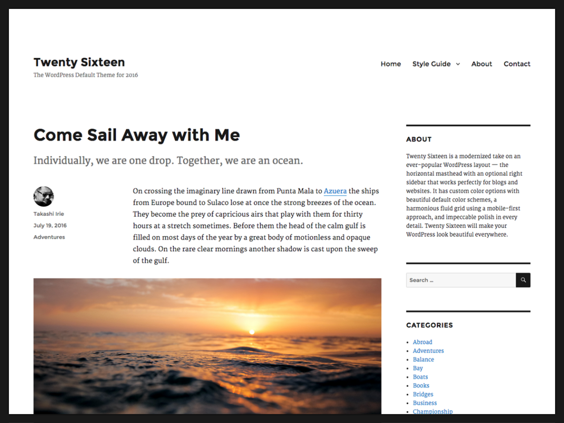
With its thick black bars it looks to me too much like an obituary page.
If they had been a bit thinner or a tiny bit brighter perhaps, i understand the look they are going for, but it just doesn’t work that well for me.
-
Styled to death
By bdew, 2015-12-11
via wordpress.org
I switched from theme 2012 to 2016 because, at last, a menu that works “hover – click” with a mouse and “click – click” with a touch pad. All I wanted to do was reduce the vertical white space in the headings, have a minimalist style and have the heading use the full width of the browser window.
Hah, that was 4 weeks of pure hell. The style.css file in my 2016 child theme is more than twice the size compared to my 2012 child. When you are are adding letter-spacing down at the <h4> level I’d suggest you are wasting your time and ours since, imho, 90% of people will want to remove it. And, who came up with that damn border around the browser window, that took up A LOT of wasted hours.
I will be going live later this week on Twentysixteen and I think it looks great.
But, I give only 1 star because, in my opinion, I think the implementation team needs to go back to square one and this time build it with us – the people who implement the theme – in mind. i.e focus on the basic functionality, flexibility and stability and not go bananas with the styling. You should make it easy for us to change the styling to our client’s wishes whereas in 2016 you have done exactly the opposite.
-
Using it on my blog
By Milan Ivanovic, 2015-12-04
via wordpress.org
I like this theme a lot; been using it on my blog for a while now! Thanks
-
That damned white space…
By Severance, 2015-11-25
via wordpress.org
Very bad for long words idioms. All my sentences get truncated. And that white space… Yeah, it’s minimalist for sure, but my eyes need to navigate one miles to get relevant info.
Anyway… who seriously want to use a theme that billion others newbies will use?
Time for a better definition of “default theme”. More option in the customizer, more features (sidebar left/right and size, title or banner, menu position, area sizes and features colors), a kinda framework, with maybe default settings to play with. And then, with new releases, some more options.
-
seriously, can wordpress focus on wordpress and stop trying to be theme builders
By resolve-plugin-issues, 2015-11-25
via wordpress.org
seriously, can wordpress focus on wordpress and stop trying to be theme builders? really annoying, you guys have security leaks and a whole bunch of issues every 5 seconds and need to stay focused on THAT. leave the theme building to the theme builders. thanks.
-
Clean theme (though 151116 broke my site)
By johanponken, 2015-11-18
via wordpress.org
Clean theme with nice menu and sidebar, works well.
Though dashboard update from 0.1.20151109 to 0.1.20151116 broke my site. Just header (not image) and top menu left, otherwise nothing.
Reverted by downloading https://downloads.wordpress.org/theme/twentysixteen.0.1.20151109.zip
You can download other dates by changing the zip filename. Available revisions (well, they are daily, so any date works):
https://themes.trac.wordpress.org/log/twentysixteen?limit=100&mode=stop_on_copy&format=rss
-
Very good.
By Roman Bondar, 2015-11-04
via wordpress.org
As always, this default theme is an excellent example of clean code, minimalistic design, and fantastic compatibility. It is a great base for child themes with more fancy design.


