-
Excellent change
By Alamgir Hossain Shemul (Shemul49rmc), 2013-10-25
via wordpress.org
Its really good but lack some professionalism.
-
OK
By Pqqq1, 2013-10-25
via wordpress.org
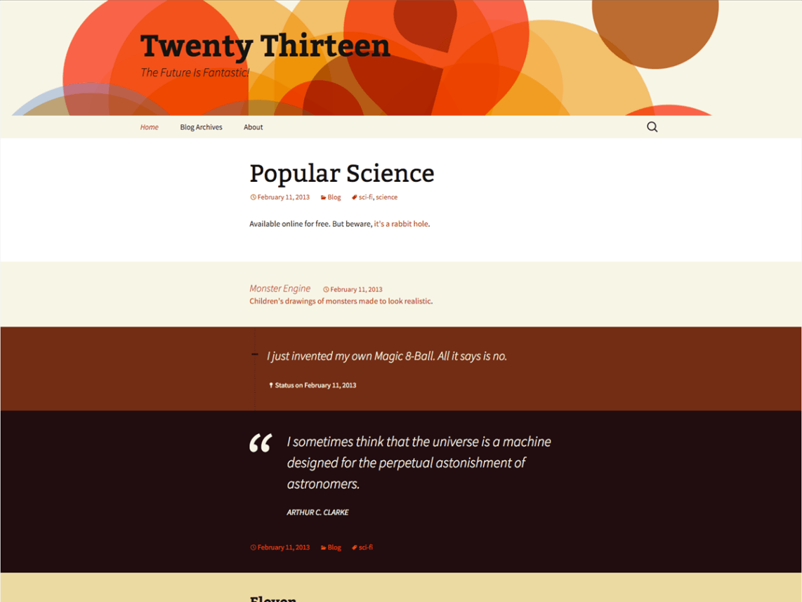
It’s OK, but I don’t like the color.
-
frustrating
By oelja, 2013-10-25
via wordpress.org
Documentation of CSS and functions on this theme is crap, codex isn’t jiving and [unnecessary comments about forum moderator removed].
-
Error: Missing required field "updated".
By christopherdubeau, 2013-10-12
via wordpress.org
THe biggest compliant I have with themes from wordpress is their lack of microdata compatibility. Evey single theme has an issue with hentry as it is in the main class description for the page.
I wish they would remove the hatom feed and go to a full html5 schema.org mark up instead.
Error from 2013 new install blank with using a page as the front instead of a post.
Extracted structured data
hatom-feed
hatom-entry:
entry-title: Microdata Project
entry-content: Microdata uses simple attributes in HTML tags to assign brief and descriptive names to items and properties. Here’s an example of a short HTML block showing basic contact information for…
Error: Missing required field “updated”.
Error: Missing required hCard “author”.
Obviously a page does not need to have these fields but either add them to the theme through meta tags or fix the main theme page include class.
I design/build several sites a month for clients and there has not been one theme that I have not had to fix due to this or similar problems.
Errors on the page can significantly effect your overall SEO score.
-
Twenty Thirteen
By insaneasick06, 2013-10-12
via wordpress.org
Not really feeling this one all that much
-
Header Image
By kenbird, 2013-09-25
via wordpress.org
I am having the same problem with the header image not working on the twenty thirteen theme. To get around it I am using a plugin called “twenty thirteen header animations” – I can only get one header to show although there are 4 images to choose from – I I am not good with PHP. I am also having problems seeing my media library images in the same theme.
-
Adore the style typography and design
By Robert Dall, 2013-09-25
via wordpress.org
I adore the typography and it’s responsive design and how it bring the default WordPress theme back to blogging. I really like it…
But I always liked my titles above the post content so I created a child theme called r2d2. Which is available for you to download in the WordPress Theme Directory.
-
Cool Theme
By tonyteo, 2013-09-25
via wordpress.org
Just deploy my coupons site with this theme. Super fast load with minor modification. Love it much when load by mobile devices.
-
Ilove the header
By julienne, 2013-09-25
via wordpress.org
Asthetically I liked the Thirteen till I wanted a site’s RSS,and an Image of 160 x 223, that all that was in the sidebar. I thought at first the Image being top was pushing it down but I removed it and its still the same.
I love the Twentythirteen, but it needs sorting out in the sidebar, it drops down to the footer.
Other default themes I can have half dozen widgets without the sidebar dropping.
At the moment I am horrified to find my RSS link from another site has dropped to the footer and I only asked for five posts from the RSS as I always do.
I tried reducing the widget font but it makes no difference, I edited the font to “Verdana”, still no difference I did that because most people don’t have certain fonts on their systems thats in the style sheet..
I don’t know what to do now, what theme.
-
only the color impressed me
By jackniu, 2013-09-25
via wordpress.org
only the color impressed me, not like it.
The overview layout is not well organized
-
Worst Theme yet
By kkathman, 2013-09-25
via wordpress.org
Just try customizing the header and you’ll see VERY fast that whoever put this theme together spent about 5 minutes and didn’t had no skill to take advantage of real progress that other authors have used!
Go back to twenty-eleven and use that… it’s only gotten worse since then!
-
Nice design n color
By dwiut, 2013-08-25
via wordpress.org
Great job devs.
I think this theme don’t provide sidebar, but after I try secondary widget it the new sidebar.
Thanks
now my amsyong.com has clean appereance.


