Beautiful Modern Looking Theme. Sadly, Limited By The Template Design
By rmkirkner, 2015-11-27
via wordpress.org
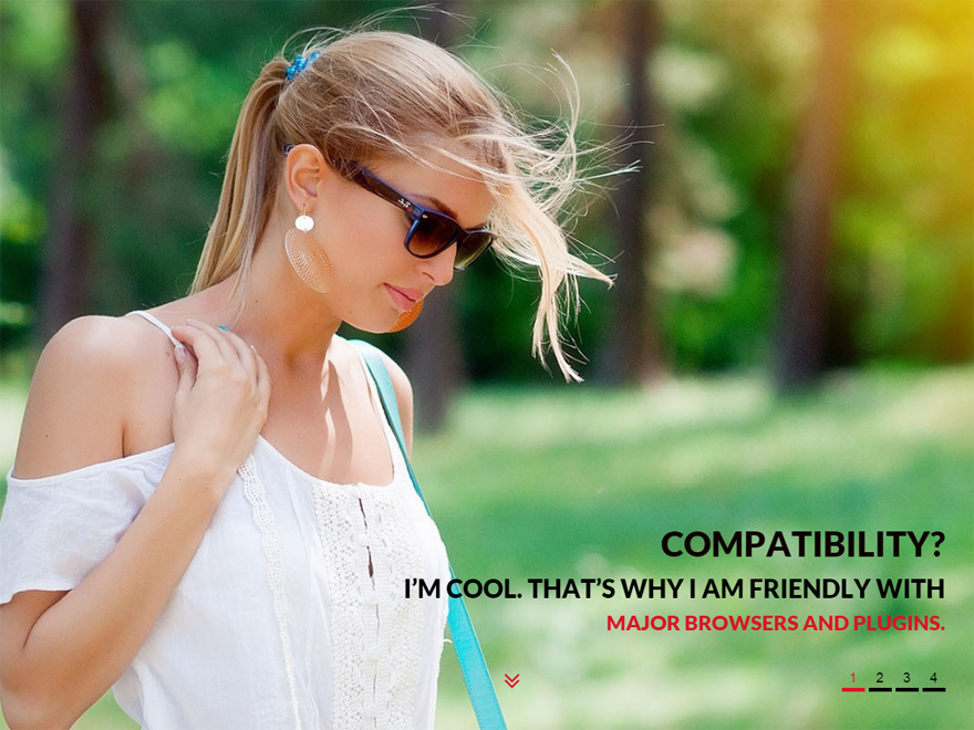
Overall Gaga lite by AcessPress themes is a very 2015-trend modern looking WordPress Template that allows you to create a beautiful single landing page with a full screen slider and parallax Call To Action Sections.
Its FREE and it’s responsive. The Live Demo of Gaga Lite on AcessPress’ site will show you a strong landing page style that offers good-looking bold graphic and text styles through a default to Google Fonts’ Lato.
Give it a good amount of tinkering in WordPress’ Customizer and you’ll have a site that looks like that template, but only that With this theme don’t expect more than meets the eye.
Currently, the page for this theme teases a Compare Free and Pro button that links to nothing. This theme is brand new and named Lite.
Stay tuned for a maturation of this theme. Perhaps we will have a Gaga Pro. If offered, I would have bought.
The Bottom Line is that the theme is limited and really starts to break down if you are looking to have it do more than function as a nice lander.
I chose this theme working on a tight 10-day deadline to customize and Child Theme for a full on political campiagn hub. The amount of time that I spent fighting with the theme to get it to do what I wanted, greatly hindered the amount of creative finesse discovery and customization in the launch-ready site. I’ll tell you about problems that I ran into. First, general issues every WordPress user may face, and then the code stuff.
General Grievences
- It’s not as intuitive as suggested by AcessPress. You’re going to have to read the Documentation Material on this theme to figure out how it all fits together, and it’s not in the best English.
- For the nescesary background images, There are no suggestions for image size and crop. Luckily, I knew what I was doing.
- There is an ambiguity in the Static Front Page vs Recent Posts option that is in the Customizer Menu twice and is not too deeply explained in the theme Documentation. I can’t imagine that anyone would want to use the Recent Posts choice beacuse:
- The blog styles really leave something to be desired. Text is very small, making it hard to read in a sans-serif. No good looking options for text-image interaction.
- The Site Branding Logo as a home page link in the Navigation Bar does not work for multi page sites. It just reloads the current page when you click on it. I adamantly did not want to have a cliche HOME button, but could not remedy the issue on my own and had to settle.
- I wanted a Call to Action above the fold. Can’t be done in Customizer.
- If you want a static full-screen image instead of a slider. The slider feature will still dispay #1 and allow users to carousel that single image in mobile
Adding my own customizations to this theme, I felt that I constantly had to hack and hack at the CSS just to get things to display correctly with the amount of content that I had to take care of (Not That Much… An About page, Contact Page, and a blog for News and Events.)
Tech Troubles
- If you have more than 5 Nav links and want a centered Navigation. The Nav bar covers the site Site Branding Logo due to absolute positioning. Transparent but makes the Site Logo unclickable! I fixed this with a z-index rule.
- If someone can shed some light on how to edit the Header.php file to make the Logo link to the home page please do. Would be greatly appreciated. I tried several changes to no avail.
- Images for the parallax sections are not responsive. I used simple non-busy images for the backgrounds. On a Mobile viewport, the responsive styles just zoom into the image, which just leaves me with a blank color.
- The Full Screen Slider takes up about only 1/3 of the above the fold page on mobile screens. I really wish it stayed full screen because it’s an important Call to Action Area in my design.
- If you want extra’s you’re going to have to find a solution. No room for expansion past the built in 4 widgets. I feel silly giving my client a manual for their site that says “The Embedded Youtube Video is inside the Gaga Pricing Table Widget that can be found in the Pricing Section> of the ‘Hompage Setting’ within the Customizer”
- There are misspellings in the CSS (mainly in the class selectors and ID’s) that caused me some undue frustration.
Do I have a lot of room to complain about a free theme? Meh… maybe not, but since a Paid version is not offered I’ll leave this here as Feedback for the theme creator.


