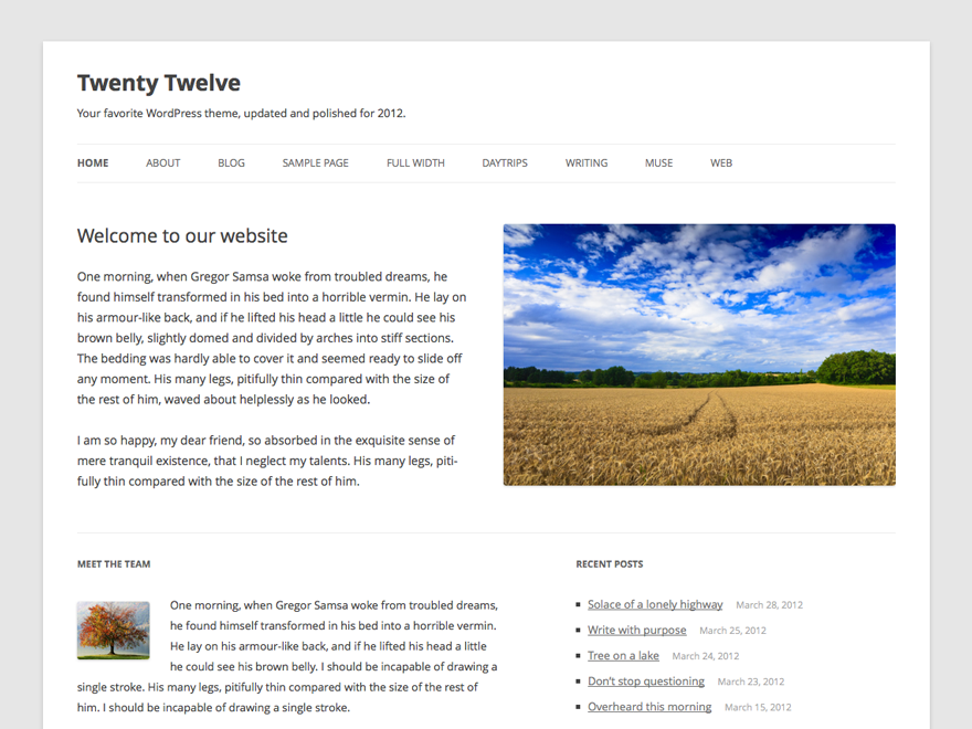
-
Minimalistic, a good base theme
By ajamm, 2013-02-25
via wordpress.org
I am building a number of websites on this currently. It lends itself to easy coding, though the IE8 issue raises its head for me too.
CSS I add, works fine in Chrome and IE9+ but in IE8 looks pretty ugly.
However, I really like this theme!
-
Stop hunting for the perfect theme. Make a child!
By alaburb, 2013-02-25
via wordpress.org
Pros: This clean responsive theme is an excellent basis for your own child theme. Most of what you need is here.
Cons: Wish it had a 3-column blog layout option (currently 2-column).
-
Good but tiny MENU button won't expand on cell phone
By Jimmy, 2013-02-25
via wordpress.org
Trying to use this for a client. When viewing website in landscape mode on a cell phone, clicking on the Menu button does nothing. Anyone know how to fix this?
-
Great but not compatible IE8
By miketurco, 2013-02-25
via wordpress.org
I think this is an awesome theme, if only it truly worked on all or mostly “all devices” as is the claim. I’m glad I checked out the theme in IE8 before putting much work into it. The visual quality of this theme degrades significantly in IE8 and IE7.
I checked my stats for “year to date” and see that 10% of my visitors used IE8 and 2% used IE7. I could live with something that isn’t IE7 compatible, but to leave out one of ten visitors to my site is unthinkable.
Of course, that is due to the fact that my site is a business site and the crowd to which I cater. Still, though, it seems almost irresponsible to say that the theme looks great on all devices, as opposed to saying up front that it works with some browsers and not others.
-
Good, not great
By paulwpxp, 2013-01-25
via wordpress.org
I give it 3 out of 5, why ?
The rem thing alone already turned me off, couple that with the mobile-first-attitude, and that takes 2 from the 5, otherwise it’d be big 5.
These are 2 references to the usage of rem in the head of Twenty Twelve’s style.css
---------- Further reading http://snook.ca/archives/html_and_css/font-size-with-rem http://blog.typekit.com/2011/11/09/type-study-sizing-the-legible-letter/
Now, please go “take a look” at Jonathan Snook ‘s own site above, he doesn’t even use rem he uses px and the blog at typekit too, it uses px
Since when that WordPres’s default theme is for testing new and un-proven technology for the rest of the world ? Why WordPress take the plunge for them ?
Here is the link that I think it might be useful for 2013 defaut theme’s development.
Relative pixels
-
Nice theme
By Devtard, 2013-01-25
via wordpress.org
I love it.
-
Less Is More, But I Do Miss A Few Things From Twenty Eleven
By YourWordpressFriend, 2013-01-25
via wordpress.org
I like the new Twenty Twelve, but I’m missing a few things such as the ease with which you could change colors of links and I certainly miss the footer area, hoping thus someone might build a plugin or something for that.
I wrote a greater in depth review, which you can read here:
-
great starter
By jared Erickson, 2013-01-25
via wordpress.org
way better than all other twenty x themes
-
Clean and Beautiful
By Sovit, 2013-01-25
via wordpress.org
I love the way it is. Clean and Beautiful. Inspiring theme for 2013 as well.
-
Solid reboot and excellent base for future child themes
By Morten Rand-Hendriksen, 2013-01-25
via wordpress.org
Twenty Ten was great in its simplicity. Twenty Eleven was somewhat cluttered and filled with extraneous bulk. Twenty Twelve has gone back to the minimalist roots of Twenty Ten and taken things a step further by simplifying and de-complicating everything. Because of this it is a great parent for child themes. But that’s not all. The extremely well documented theme files also make the theme an excellent starting point for people wanting to learn more about how to build themes and it sets a new benchmark for simplicity and minimalism where coding is concerned.
The one major drawback of the theme is the lack of support for IE8. Though this looks to be fixed in the next version, the real problem here is the reasoning behind the decision to not make it IE8 compliant. This was not a case of lessening the quality of the theme, but rather one of jumping ahead of the curb and leaving those cursed with IE8 in the wake. It is unnecessary and sets a bad precedent. Whether politically motivated or just the result of an oversight I hope that future theme releases will take a less extremist route. But like I said, this is a small hitch that looks to have been resolved.
-
Light, responsive, using as a small framework to build sites
By Tomas Mackevicius, 2013-01-25
via wordpress.org
It’s also very minimalistic which has some effects on features, but I’m adding them back within child theme.
-
Nice but buggy….
By sinusite, 2013-01-25
via wordpress.org
Bug if you use a second functions.php in a child theme : the Saving Taxonomy button doesn’t work (no page list resfresh)…
I lost 2 working hours to understand that


