Themes Hunter
Categories
Login
About Themes Stats Blog Video Contact
Register Log in

Twenty Twelve

Home Blog / Magazine
Download Add to compare
Information Features Screenshots Reviews (165) Customisation

Latest Customer Reviews

Simple By jhango, 2016-12-15 via wordpress.org

I love the simplicity.

See all customer reviews (more based on 165 ratings reviews)

Description by Author

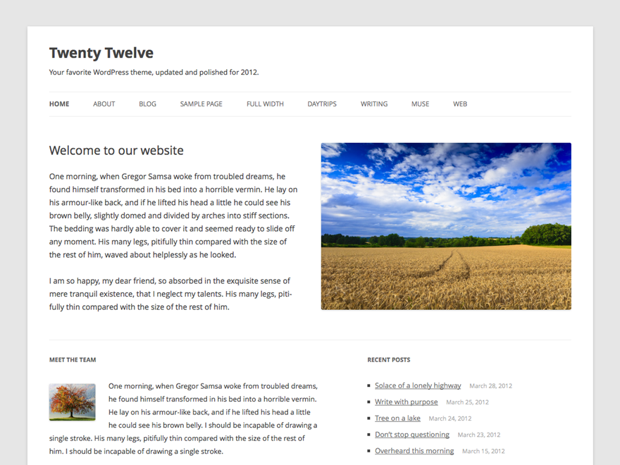
The 2012 theme for WordPress is a fully responsive theme that looks great on any device. Features include a front page template with its own widgets, an optional display font, styling for post formats on both index and single views, and an optional no-sidebar page template. Make it yours with a custom menu, header image, and background.
Theme cover

Average customer rating

4.5

based on 165 ratings

Rating snapshot

127
25
6
4
3
  • good By tamimadam, 2012-11-25 via wordpress.org

    awesome

  • Clean and Simple By chimpz, 2012-11-25 via wordpress.org

    an excellent theme to customize. very clean

  • Russian Language – русский язык By outstanding45, 2012-11-25 via wordpress.org

    russian version is here http://www.2bota.ru/
    русская тема twenty twelve тут 2bota.ru

  • Clean!! By saulomatias, 2012-11-25 via wordpress.org

    Very good!

  • I will second the impact of lack of support for Legacy IE in Twenty Twelve theme By Paddleman, 2012-11-25 via wordpress.org

    I second the issues with the IE Browser support. I don’t agree with the previous poster below that this is now fixed. {Or may be it is fixed for IE 8 and ot for IE7).

    A lot of people accessing my site from ‘managed cloud’ or ‘corporate desktop’ are on Windows Server 2003 clients – which only supports Internet Explorer 7.
    I wish it would gracefully downgrade the user experience for these people (rather than render the mobile theme).

    The serious problem with the Mobile theme on a desktop IE 7 is the lack of up and down scroll functionality!!!

  • Almost Average By Theatreadmin, 2012-11-25 via wordpress.org

    I loved the simplicity of the design, but the color choice hurts my eyes. It’s too white. I wish that it had a place to change the colors. Otherwise, I think it’s perfect.

  • Confusing for Newbies By ithacaindy, 2012-11-25 via wordpress.org

    Outwardly, the default theme view is bright and clear, but inward, the code is muddled by unneeded complexity. I was instantly stymied just trying to expand the theme’s max width from 960px to 990px. I guide to editing the theme would have been welcomed.

  • Great theme for developers By Konstantin Kovshenin, 2012-10-25 via wordpress.org

    My rating has gone somewhere, or perhaps deleted by a moderator

  • A good default theme By Samuel Wood (Otto), 2012-10-25 via wordpress.org

    As the new default theme for the upcoming WordPress 3.5, it’s a very good example of how to code some interesting features. Some of the included features:

    – An option to use the Open Sans font from the Google Fonts API
    – A no sidebar page template for use on Pages
    – Excellent post format support
    – Full support for the Theme Customizer

    It’s also fully internationalized and translatable, and great for child themes as well.

Leave a review

Leave Review

WordPress Theme Installation / Wordpress Migration / Transfer / Cloning / Change Domain

Our Services as follows:

  • WordPress Installation. Free
  • Installation of Themeforest theme $49
  • Installation of Templatemonster theme $39
  • Adding plugins to WordPress $29
  • Renaming menu $45

Ways of communication:

  • Phone support
  • Chat 24/7 support
  • Email support
More info
Coming soon...
Coming soon...