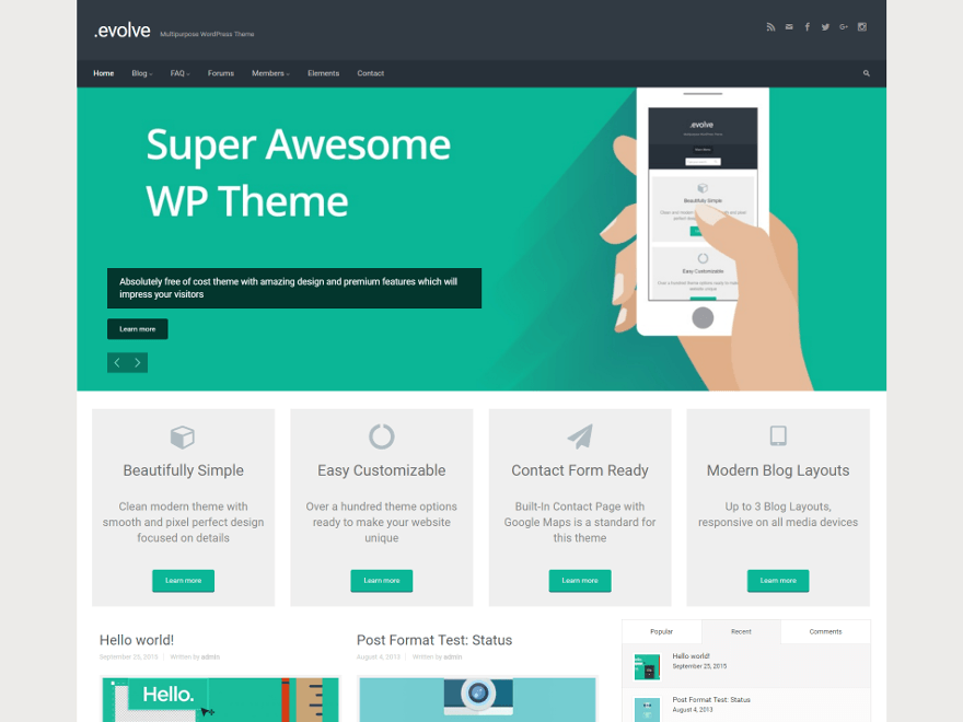
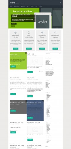
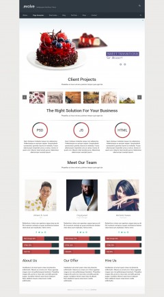
-
Five star feature
By garansindo, 2015-03-25
via wordpress.org
Very good features. Big thanks to the author
-
Thanks to developers
By Ruslan74, 2015-03-25
via wordpress.org
Want to say really thanks to developers of theme, because it’s the most flexible and comfortable theme I’ve used.
Right now I’m using free variant of theme, after several time I’m going to buy premium version and another theme “Alora”.
-
At Last
By delboy, 2015-03-25
via wordpress.org
At last a theme that I can use and with so many options. I can’t believe how easy it is. Awesome
-
Very powerful and flexible theme
By MFliorko, 2015-03-25
via wordpress.org
The theme has lots of configuration options, widgets, sliders, typography, styling etc. I like it very much and gonna to use on some my websites.
-
Great theme !
By Dimitra Rekkas, 2015-03-25
via wordpress.org
Very clever and thoughtful design, plenty of options to use.
Beautiful and fast slides. Many congrats to the authors!
-
can't fault
By forthhosting, 2015-03-25
via wordpress.org
Best so far and sliders work a dream
-
Wonderful Theme so far!
By stanwilliams, 2015-03-25
via wordpress.org
I just started playing with this theme and so far it is awesome! It has the most features of any other template I have used so far and I have used Many many templates over the years.
I began customizing this theme and was so enamored of it that I came to review it before I finished! and This is the first theme review i have ever done. I will be back to edit this if I find any negative qualities, but so far it is great!
-
Contact Form
By oneilw1979, 2015-03-25
via wordpress.org
Love this theme!
But I cannot for the life of me figure out how to activate the contact page.
-
Pleased
By lsimpson89, 2015-03-25
via wordpress.org
Happy all round with this theme. Nice design, easy to use. Does exactly what I need it to.
-
Some Work Still Needed
By Mark, 2015-03-25
via wordpress.org
I like the theme, but it has some poor styling features that require source code fixes.
1. Header – very limited choices, should have included the option to upload our own background image (or pattern). Also positioning of any logo is far too limited currently along with any title/logo text. It is also very tedious trying to locate the css class or ID that addresses the logo to insert a custom css.
For web designers running a business and charging for their time, trying to track down CSS selectors that address any one element is very time consuming and certainly costly to their clients.
2. Contact form – borders for the text/input fields are so faint (very light grey color), they are hard to see. When designing websites the design has to take into account people with vision issues and a faint grey is a very bad choice for borders on a contact form. Again, the option to allow us to change the border colors would be very helpful.
3. Map – This one really annoyed me because it was locked into a position on the page that should not be. For most pages, the map is either to one side or the other or for a full width size, at the “Bottom” of the page content (mostly applies for Contact Pages). Here the options to set its position is seriously required. Its a nice feature that needs more positioning options.
4. Custom CSS – Nice feature but very limited when it comes to a responsive theme. Any custom CSS for any element breaks the preset CSS for a responsive theme for that element. Thus, unless you can provide setting options as mentioned above, a custom CSS fails to fix the issues. Getting into @media settings or the like for responsive themes using a custom CSS text box is opening the door to CSS conflicts with preset CSS responsive coding.
-
Nice theme but you've over done it with the rolling menu
By perthmetro, 2015-03-25
via wordpress.org
You’ve got way too much movement going on with this theme. especially the rolling menu items, there’s really no need for it.
-
Some Work Still Needed
By wpwd2016, 2015-03-13
via wordpress.org
I like the theme, but it has some poor styling features that require source code fixes.
1. Header – very limited choices, should have included the option to upload our own background image (or pattern). Also positioning of any logo is far too limited currently along with any title/logo text. It is also very tedious trying to locate the css class or ID that addresses the logo to insert a custom css.
For web designers running a business and charging for their time, trying to track down CSS selectors that address any one element is very time consuming and certainly costly to their clients.
2. Contact form – borders for the text/input fields are so faint (very light grey color), they are hard to see. When designing websites the design has to take into account people with vision issues and a faint grey is a very bad choice for borders on a contact form. Again, the option to allow us to change the border colors would be very helpful.
3. Map – This one really annoyed me because it was locked into a position on the page that should not be. For most pages, the map is either to one side or the other or for a full width size, at the “Bottom” of the page content (mostly applies for Contact Pages). Here the options to set its position is seriously required. Its a nice feature that needs more positioning options.
4. Custom CSS – Nice feature but very limited when it comes to a responsive theme. Any custom CSS for any element breaks the preset CSS for a responsive theme for that element. Thus, unless you can provide setting options as mentioned above, a custom CSS fails to fix the issues. Getting into @media settings or the like for responsive themes using a custom CSS text box is opening the door to CSS conflicts with preset CSS responsive coding.


